CardView是Android5.0(API 21)加入的新控件,当然,在API 21以下也能用,在build.gradle的依赖里加入下边一行就可以用了
compile 'com.android.support:cardview-v7:23.1.1'
项目中要做一个卡片浏览的程序,卡片需要有5dp的圆角,圆角效果CardView自带属性就可以支持,加上app:cardCornerRadius属性就好了,如下:
1
2
3
4
5
6
7
8
9
<android.support.v7.widget.CardView
xmlns:android= "http://schemas.android.com/apk/res/android"
xmlns:app= "http://schemas.android.com/apk/res-auto"
android:layout_width= "match_parent"
android:layout_height= "wrap_content"
app:cardUseCompatPadding= "true"
app:cardCornerRadius= "5dp" >
...
</android.support.v7.widget.CardView>
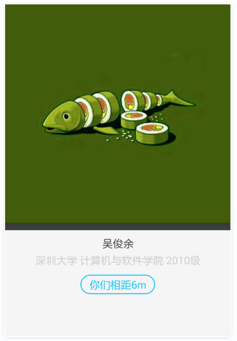
在API 21以上(包括)的机器实现了很完美的圆角效果,效果如下:
但是在API 21以下的机器出现了问题,以下是API 19的实现效果:
初步一看,虽然加上了圆角属性,但是图片边上是方的。将左下角和左上角放大仔细看下:
可以看到,CardView本身是圆角效果了,但是里边的内容却还是方的,并且出现了多余的白边。
再仔细查看CardView的文档,发现其有一个属性cardPreventCornerOverlap
1
2
3
4
Add padding to CardView on v20 and before to prevent intersections between the Card content and rounded corners.
在v20和之前的版本中添加内边距,这个属性是为了防止卡片内容和边角的重叠
<attr name= "cardPreventCornerOverlap" format= "boolean" />
cardPreventCornerOverlap默认为true,意思是阻止API 20或者之前的CardView的corner和内部元素重叠。没有重叠就产生了上边的效果,多了一条白边。于是在xml布局文件里增加CardView的属性app:cardPreventCornerOverlap=“false",左下角和左上角效果如下:
可以看到,CardView里的元素已经和CardView重叠了,但是元素本身没有圆角,所以顶点伸出去了。到这里思路就很简单了,将里边的元素单独做圆角处理。
drawable下新建shape_radius.xml文件,代码如下:
1
2
3
4
5
<?xml version="1.0" encoding="utf-8"?>
<shape xmlns:android= "http://schemas.android.com/apk/res/android" android:shape= "rectangle" >
<corners android:radius= "5dp" />
<solid android:color= "@color/f2f2f2" ></solid>
</shape>
在CardView里的元素LinearLayout加上backgroud属性
1
2
3
4
5
6
7
8
9
10
11
12
13
<LinearLayout android:layout_width= "match_parent"
android:layout_height= "match_parent"
android:orientation= "vertical"
android:background= "@drawable/shape_radius" >
<ImageView
android:id= "@+id/iv_header"
android:layout_width= "match_parent"
android:layout_height= "wrap_content"
android:layout_gravity= "center_horizontal"
android:adjustViewBounds= "true"
android:scaleType= "fitCenter"
android:src= "@drawable/ic_person_default" />
</LinearLayout>
左下角正常,左上角依然
图片还需要单独做圆角处理,这里需要的效果是,图片的上边两个角需要圆角,下边两个角需要直角。
自定义UpRoundImageView类,继承自ImageView,专门做圆角的绘制,代码如下:
1
2
3
4
5
6
7
8
9
10
11
12
13
14
15
16
17
18
19
20
21
22
23
24
25
26
27
28
29
30
31
32
33
34
public class UpRoundImageView extends ImageView {
private float mRadus = 5 * SystemUtils . getDensity ( CampusApplication . getCampusApplicationContext ());
/*圆角的半径,依次为左上角xy半径,右上角,右下角,左下角*/
private float [] rids = { mRadus , mRadus , mRadus , mRadus , 0.0f , 0.0f , 0.0f , 0.0f };
public UpRoundImageView ( Context context ) {
super ( context );
}
public UpRoundImageView ( Context context , AttributeSet attrs ) {
super ( context , attrs );
}
public UpRoundImageView ( Context context , AttributeSet attrs , int defStyleAttr ) {
super ( context , attrs , defStyleAttr );
}
/**
* 画图
* @param canvas
*/
protected void onDraw ( Canvas canvas ) {
Path path = new Path ();
int w = this . getWidth ();
int h = this . getHeight ();
/*向路径中添加圆角矩形。radii数组定义圆角矩形的四个圆角的x,y半径。radii长度必须为8*/
path . addRoundRect ( new RectF ( 0 , 0 , w , h ), rids , Path . Direction . CW );
canvas . clipPath ( path );
super . onDraw ( canvas );
}
}
将ImageView替换成UpRoundImageView, 这样就实现了全部圆角效果。
另外,可以在CardView加上app:cardElevation=“3dp"属性,这个属性加上后可以在CardView后形成一个阴影,有卡片浮上来的感觉,更符合Material Design风格。 xml中CardView的属性设置为
1
2
3
4
5
6
7
8
9
10
11
<android.support.v7.widget.CardView
xmlns:android= "http://schemas.android.com/apk/res/android"
xmlns:app= "http://schemas.android.com/apk/res-auto"
android:layout_width= "match_parent"
android:layout_height= "wrap_content"
app:cardUseCompatPadding= "true"
app:cardCornerRadius= "5dp"
app:cardPreventCornerOverlap= "false"
app:cardElevation= "3dp" >
...
</android.support.v7.widget.CardView>
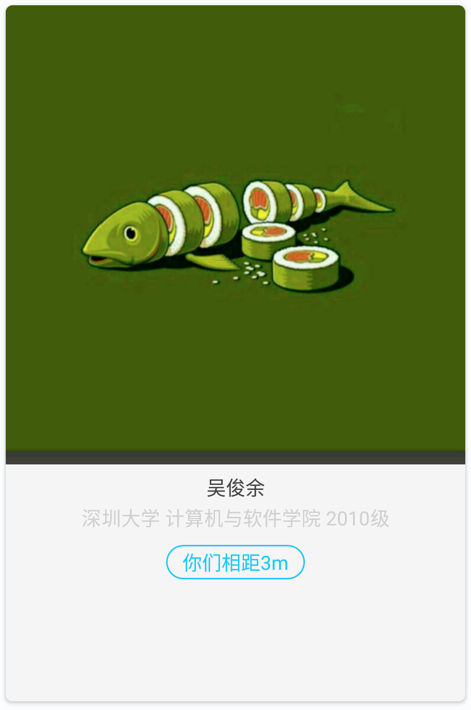
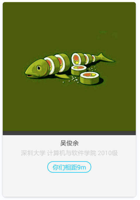
最后实现效果在各个平台一致:
api 19实现效果
api 22实现效果